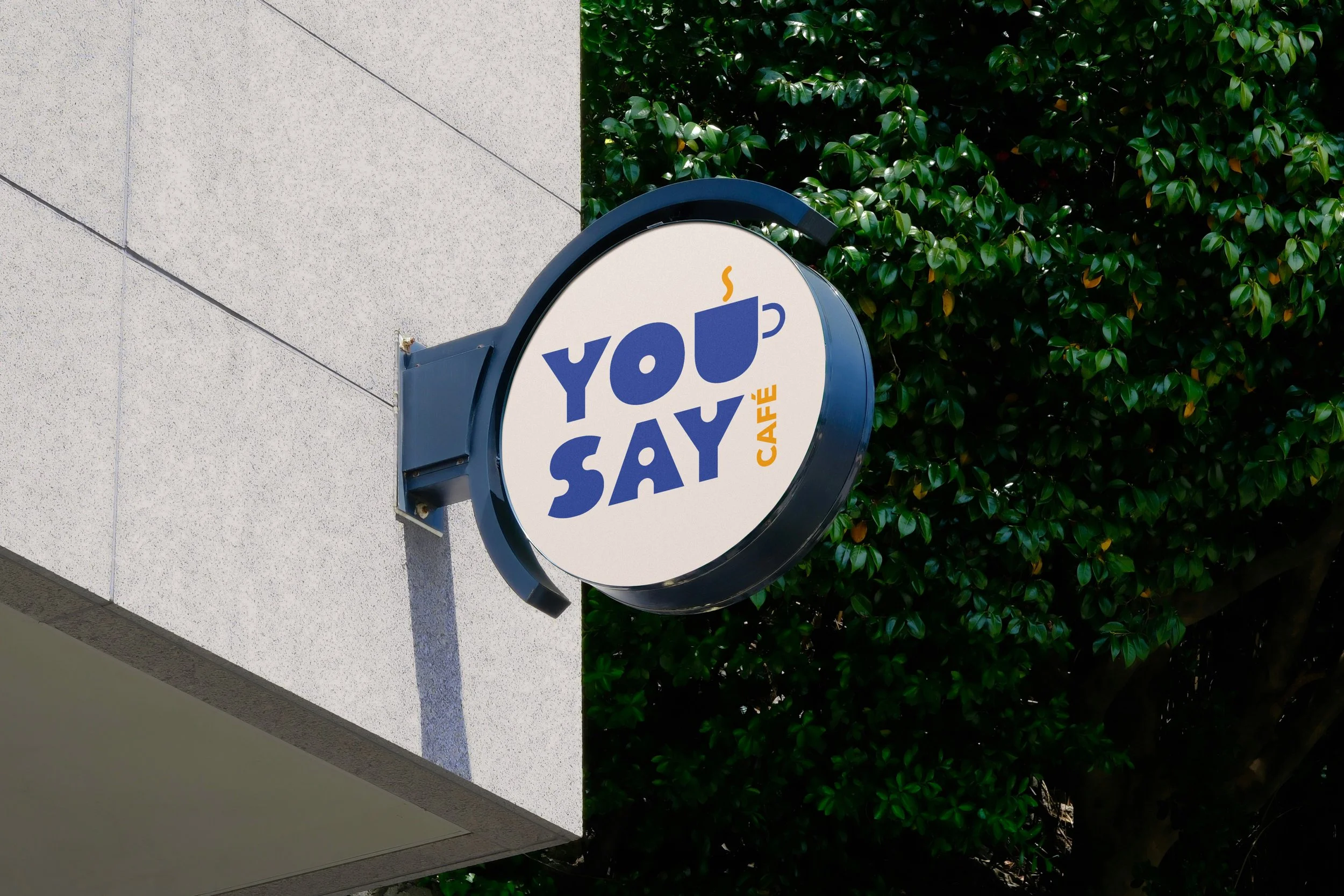
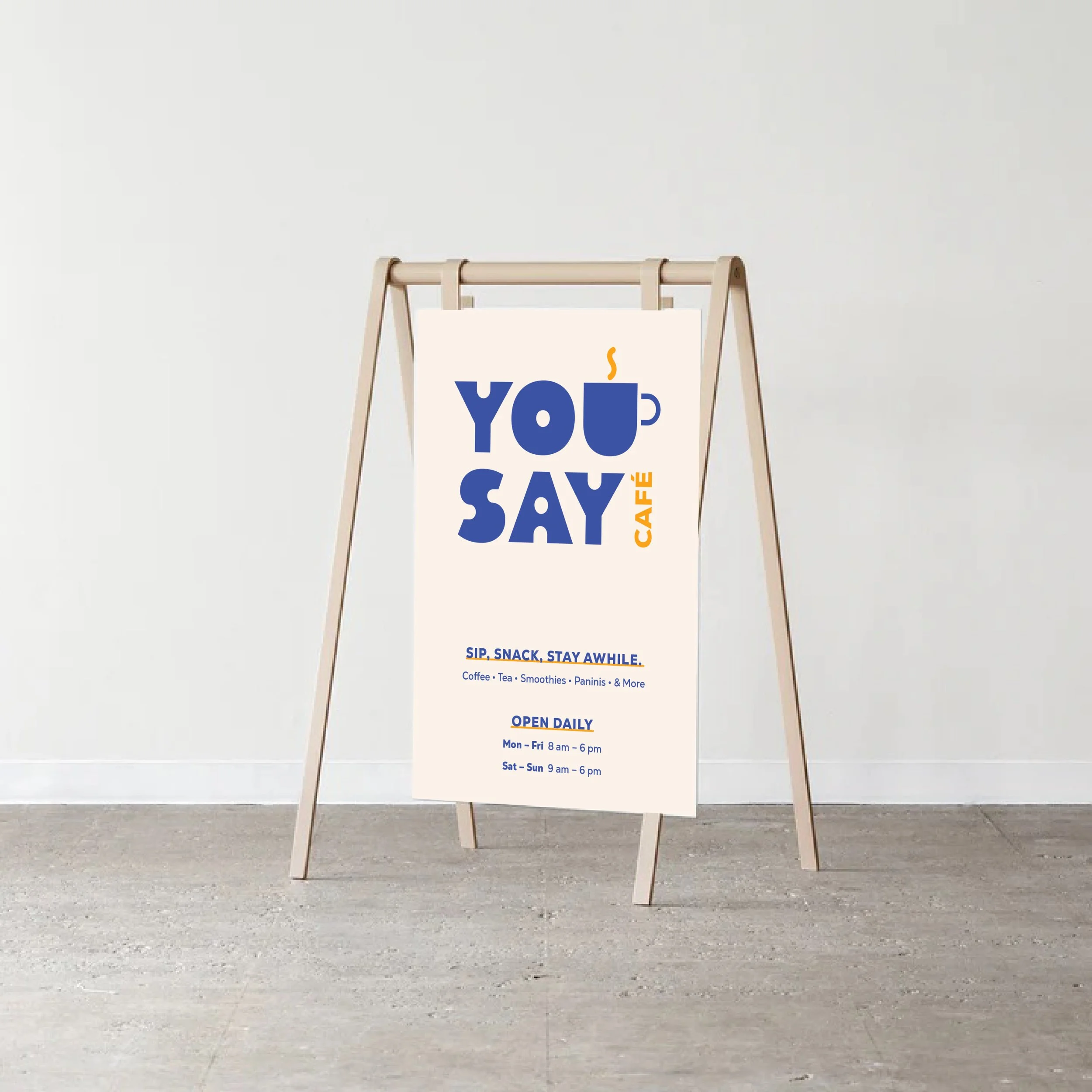
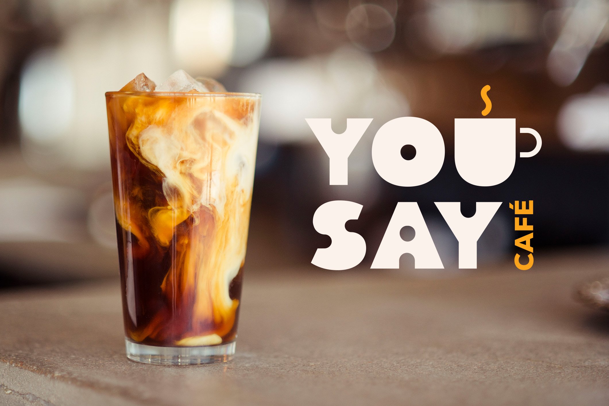
You Say Café
is a small, locally owned café located at the base of The Darien building in Northern Liberties, Philadelphia. The business sought a full rebrand to better connect with its community and align its visual identity with its mission: to provide a friendly café experience where guests feel welcome to stay, work, and relax.
The Previous Logo
The Challenge
The original logo featured a caricature of Uncle Sam—an overtly political and outdated symbol that confused the café’s purpose and alienated local residents.
Feedback gathered from the residents of The Darien and Poplar buildings made it clear that the logo wasn’t resonating with the neighborhood’s modern, diverse demographic.
The rebrand needed to express approachability,
energy, and community, while maintaining a professional and modern aesthetic that reflected the Northern Liberties area.
Design Strategy
Typography:
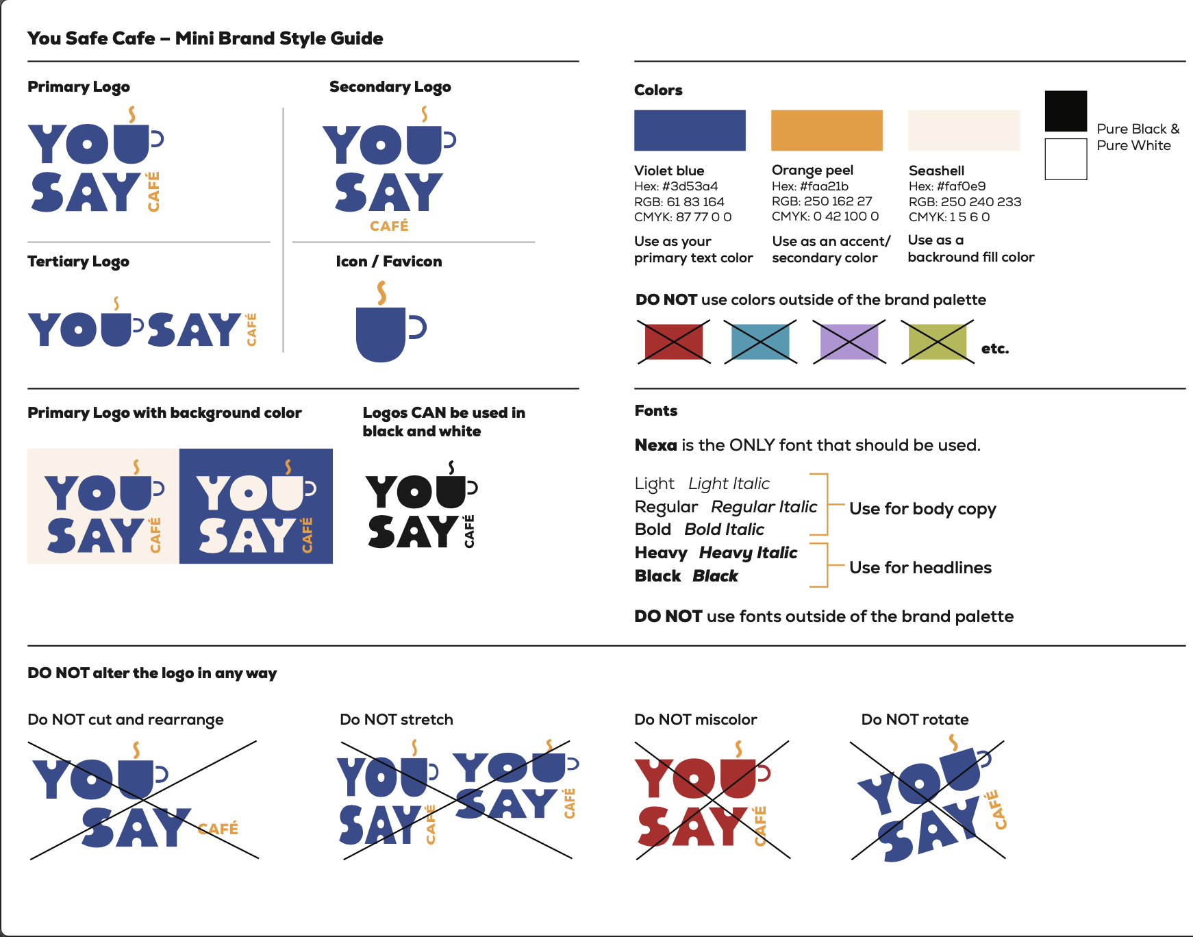
I began with the geometric sans-serif font Nexa, known for its friendly yet structured forms. To create a distinctive logotype, I customized the letterforms by cutting consistent negative shapes from each letter, producing a cohesive rhythm across the wordmark. The custom logotype remains modern, legible, and versatile across applications.
Color Palette:
I stuck with blue as the main color, but chose a new hue. This was paired with a warm cream background—softer and more inviting than stark white—and accented with a vibrant yellow-orange hue that adds playfulness and energy.
Visual Identity System:
Because the logotype was derived from the Nexa family, it naturally paired with Nexa for headlines and body copy, providing a full typographic system with a wide range of weights and complete character sets.
I created this 1-pager, mini brand guide to keep the business on track and share with any external companies they hire when creating future collateral.


