

The Geneva
Branding Concept

The Geneva is a luxury apartment concept.
My goal was to craft a visual identity that conveys exclusivity, sophistication, and enduring value—a brand that feels both elevated and timeless.

The Edelweiss Flower
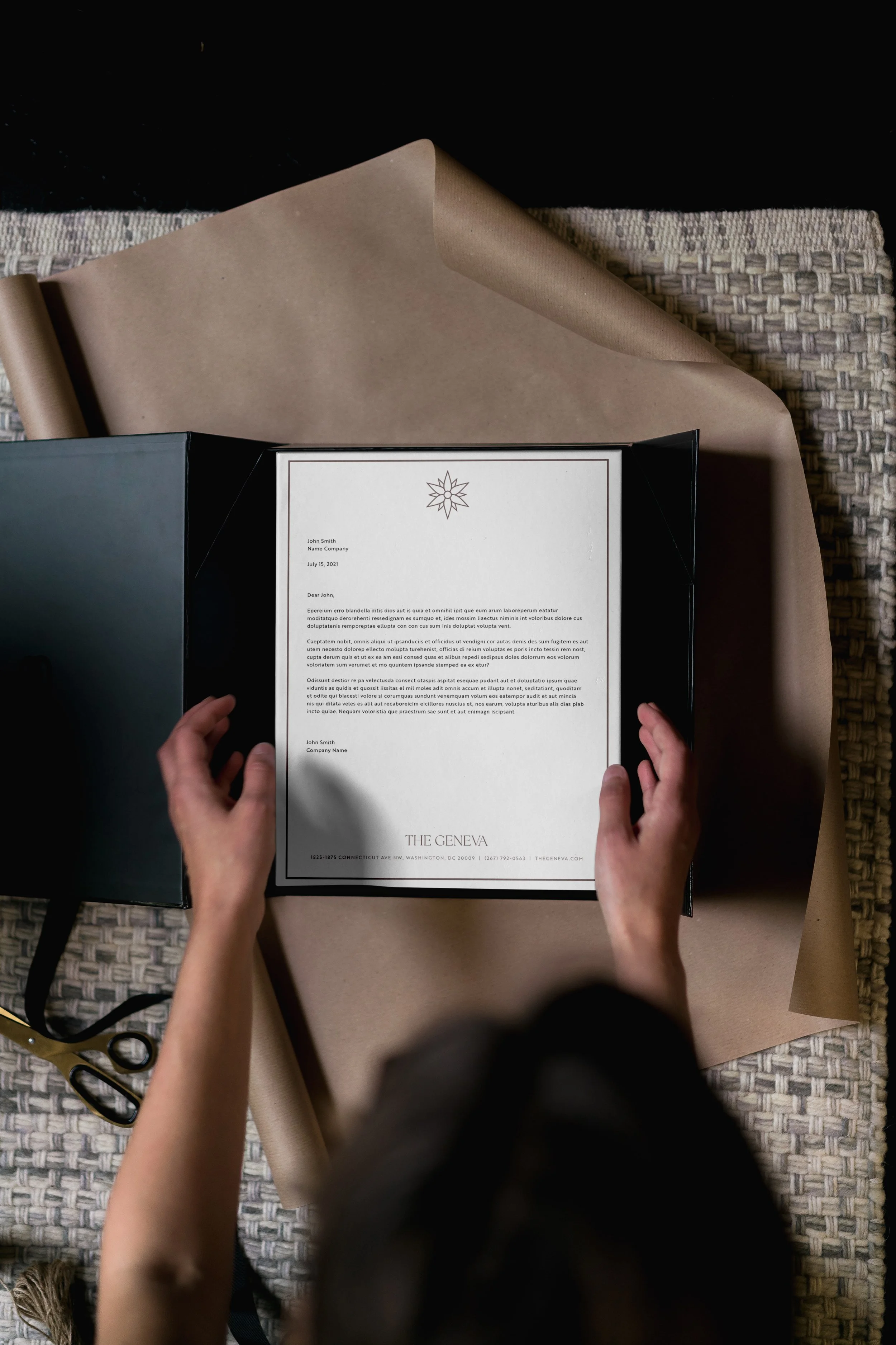
The Geneva’s logo evokes refinement through clean symmetry and elegant typography. I selected a low contast serif typeface with classic forms and graceful curves that communicate sophistication.
For the icon, I drew inspiration from the edelweiss flower—a rare bloom native to the Swiss Alps (near the city Geneva). Historically, the edelweiss has symbolized achievement, nobility, and determination, admired for its beauty and resilience in extreme conditions. Its cultural mystique made it the perfect metaphor for a residence “at the top”—a place for those of elevated taste, ambition, and stature.


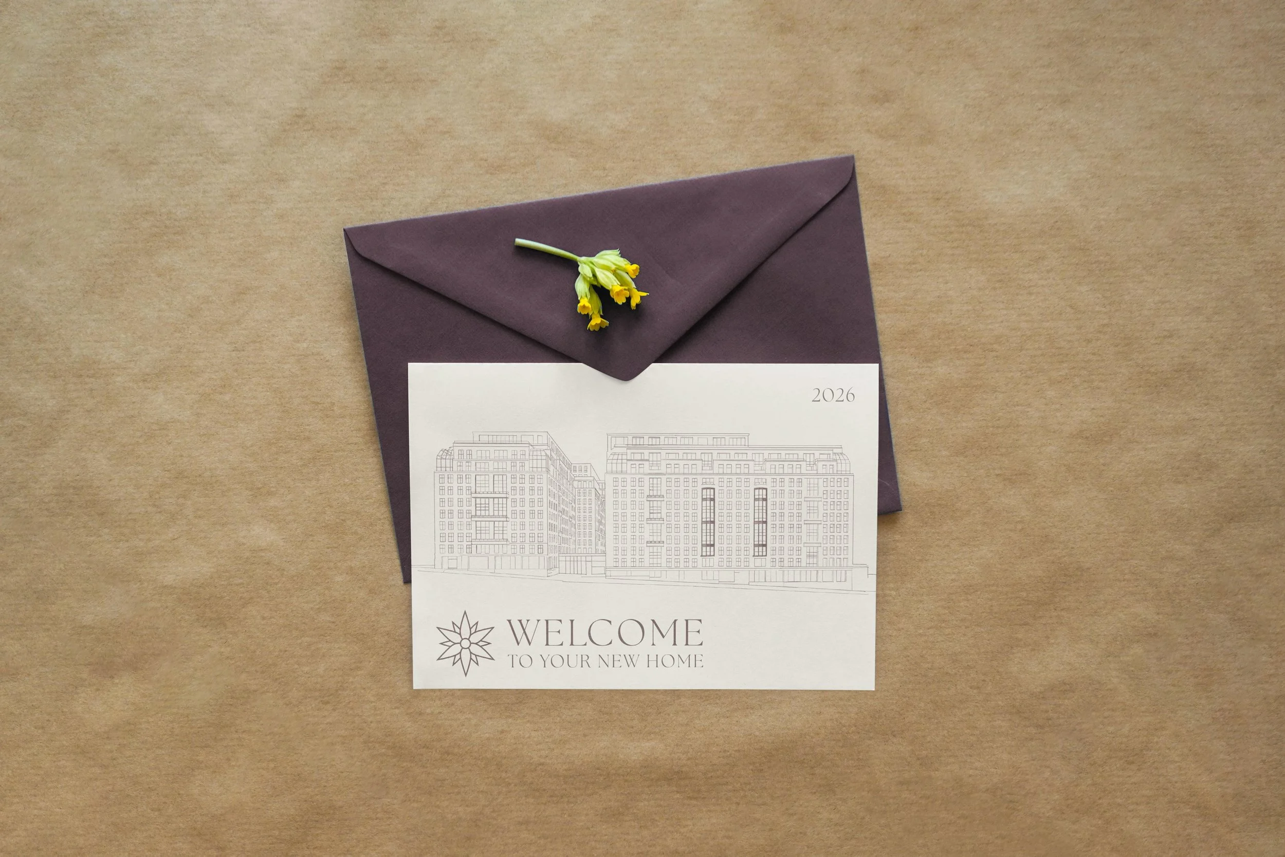
This Welcome Card (right) for new residents features an illustration of the building I created in Procreate. The illustrative quality allows for a minimalist look and monochromatic color palette.
The color palette takes cues from Benjamin Moore’s 2025 Color of the Year, “Cinnamon Slate,”—a delicate mix of heathered plum and velvety brown. It’s a warm, nuanced hue that feels grounded and modern, reflecting the idea of an inviting, enduring home environment. While I initially explored more vibrant maroon tones, this subtle shade ultimately better captured the brand’s quiet confidence and longevity.