
Summerfest
Brand System & Experiential Design
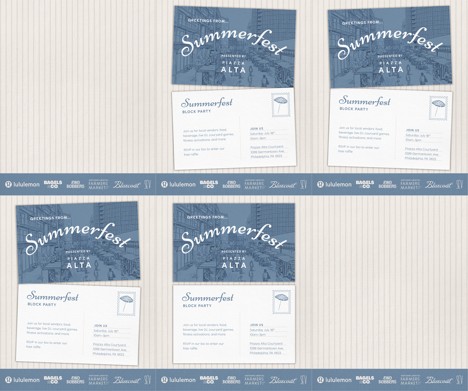

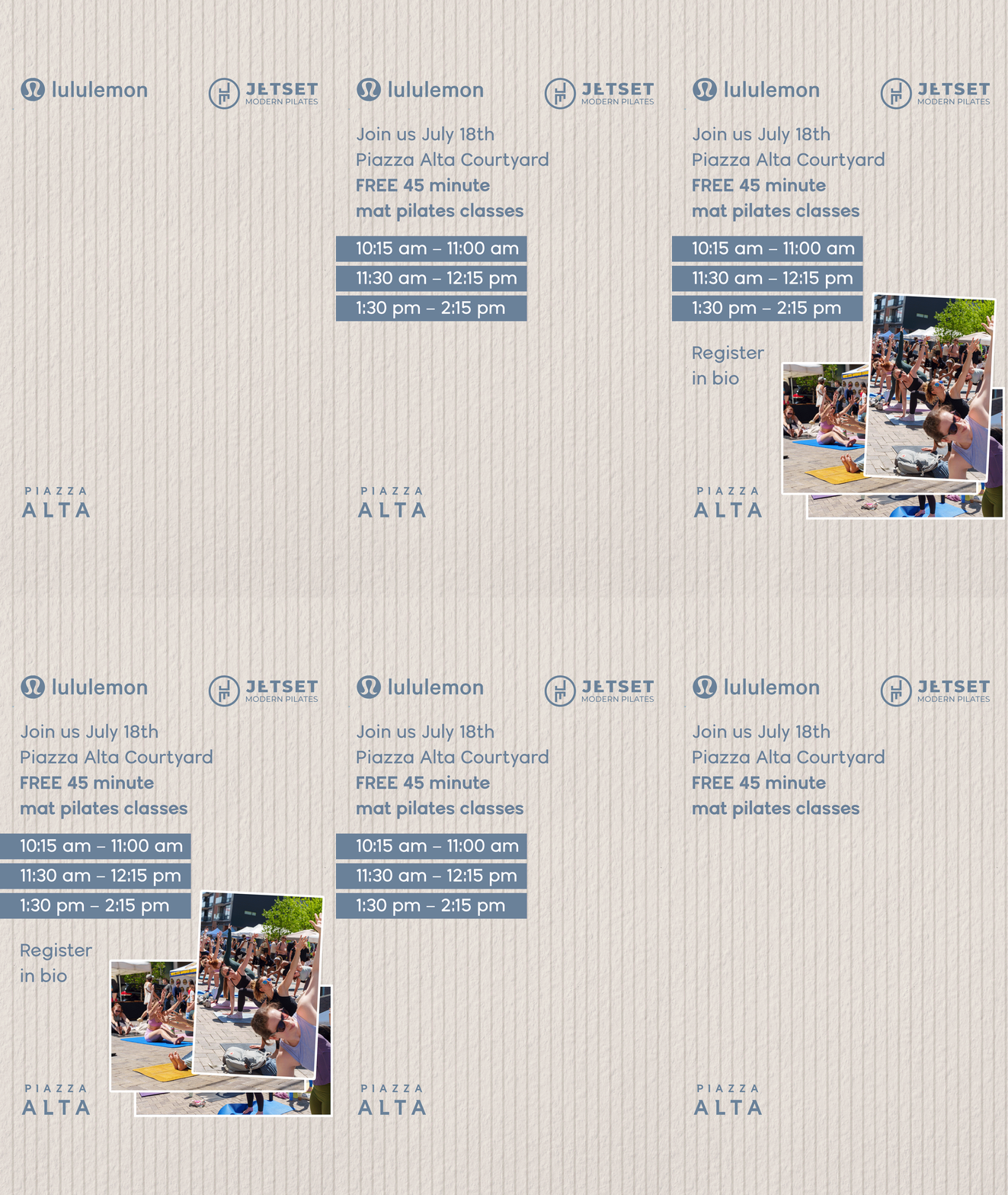
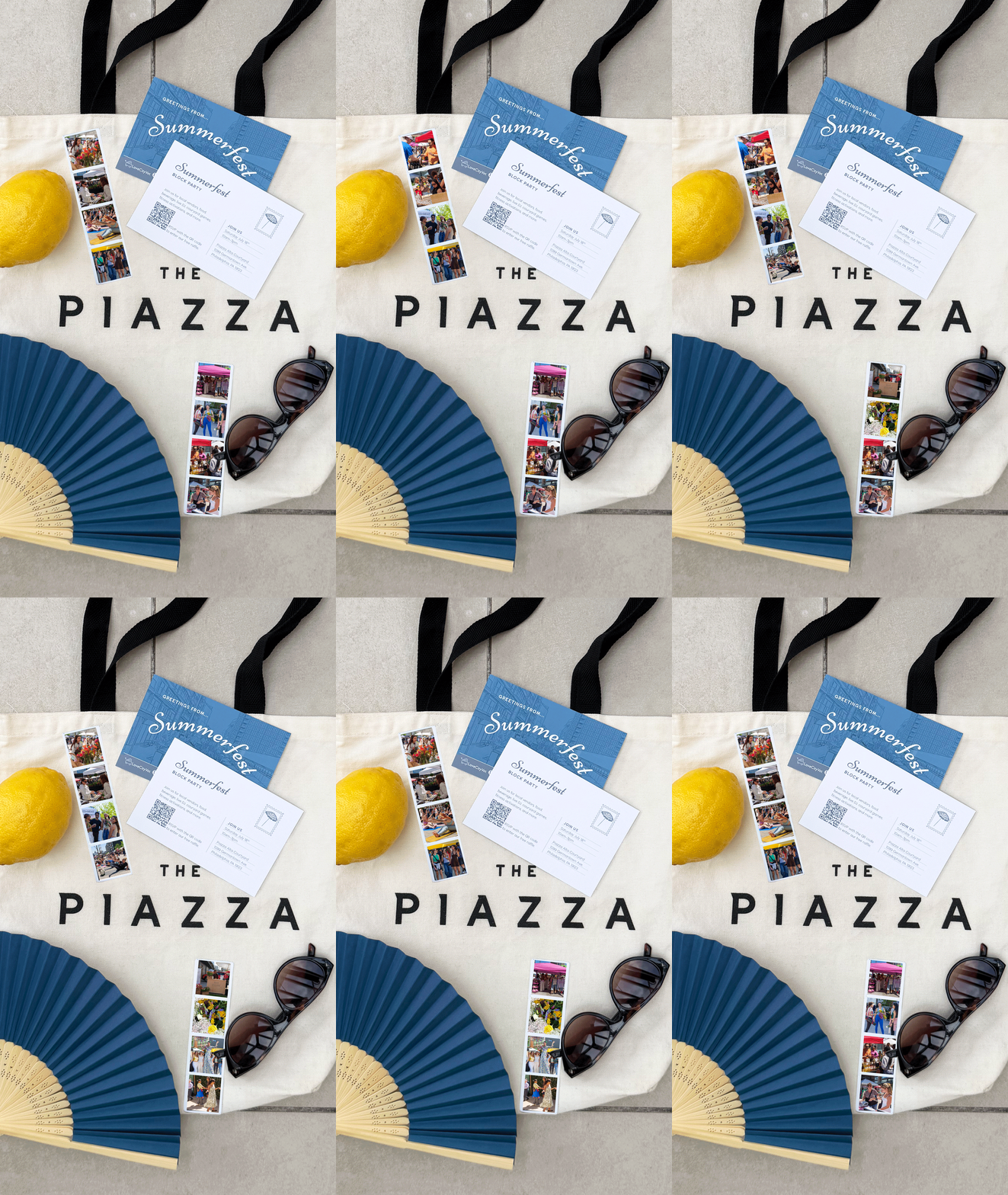
The initial invitation was inspired by the warmth and nostalgia of vintage postcards. Through layered paper textures, stickers, and tactile details, the branding creates an analog aesthetic that feels playful, inviting, and authentic. The visual system extends across invitations, signage, social media, wayfinding, merchandise, and event collateral to create a cohesive experience from the first announcement to the event itself.
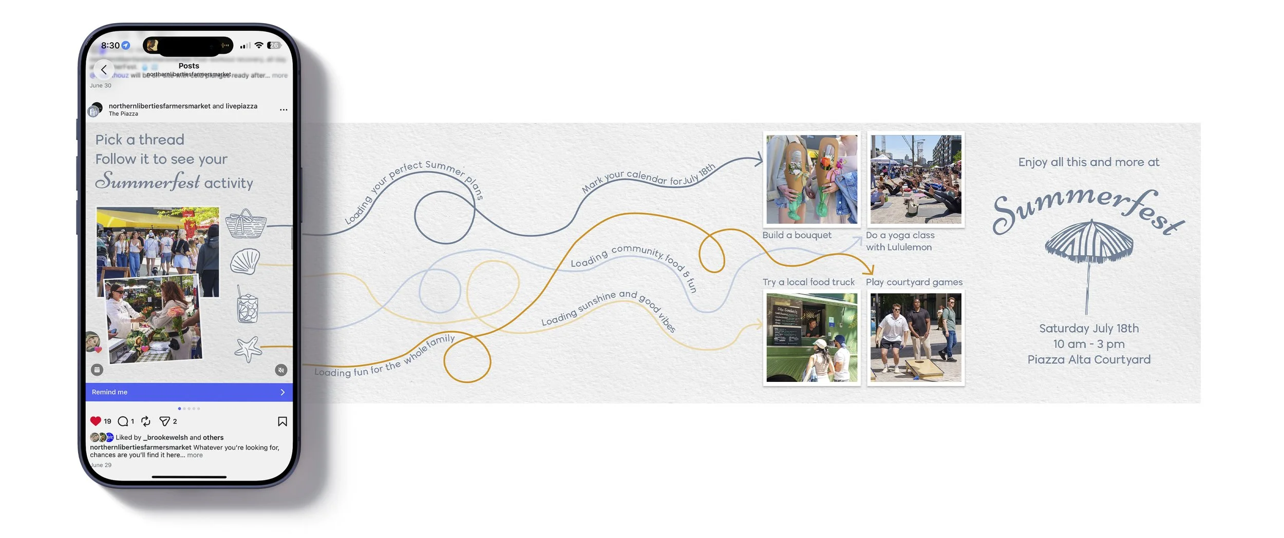
The layered compositions create greater visual interest, encouraging viewers to spend more time engaging with the design. The handcrafted aesthetics offer a welcome contrast to the polished, highly digital visual landscape people encounter every day. By drawing on familiar materials like paper, collage, and printed ephemera, the Summer Fest identity feels approachable, memorable, and human—qualities that reinforce the community-focused spirit of the event.
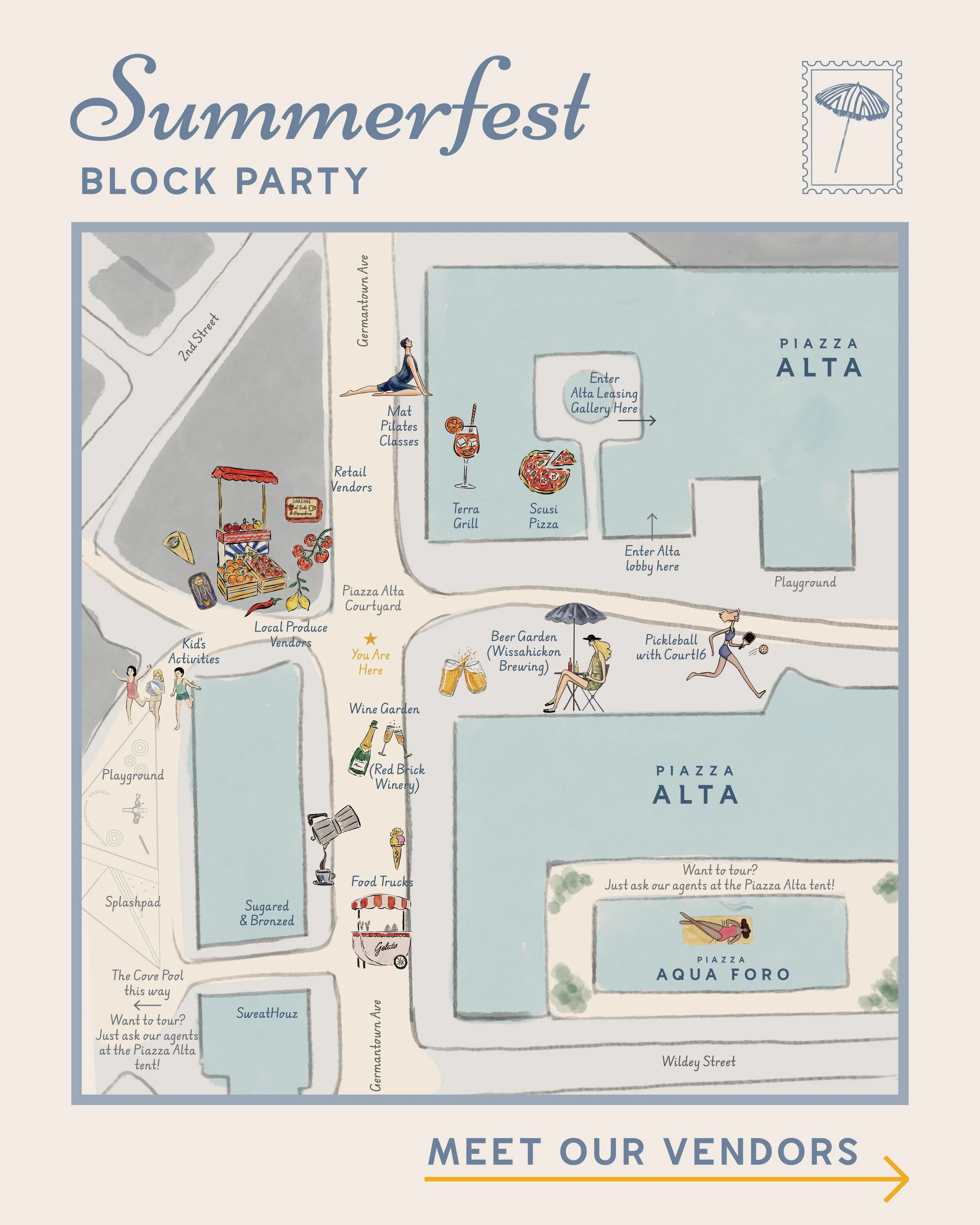
The illustrative map was drawn in Procreate and used for both social and wayfinding signage
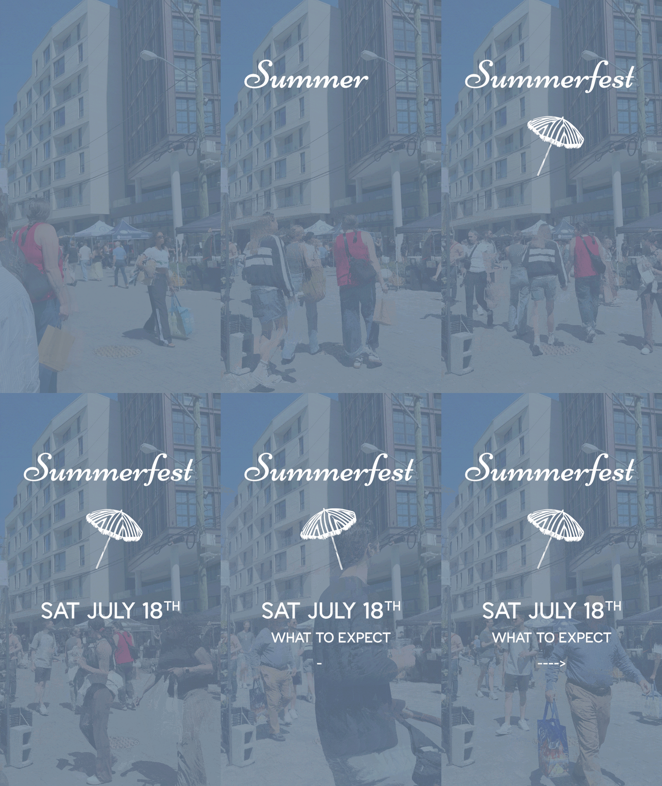
See more
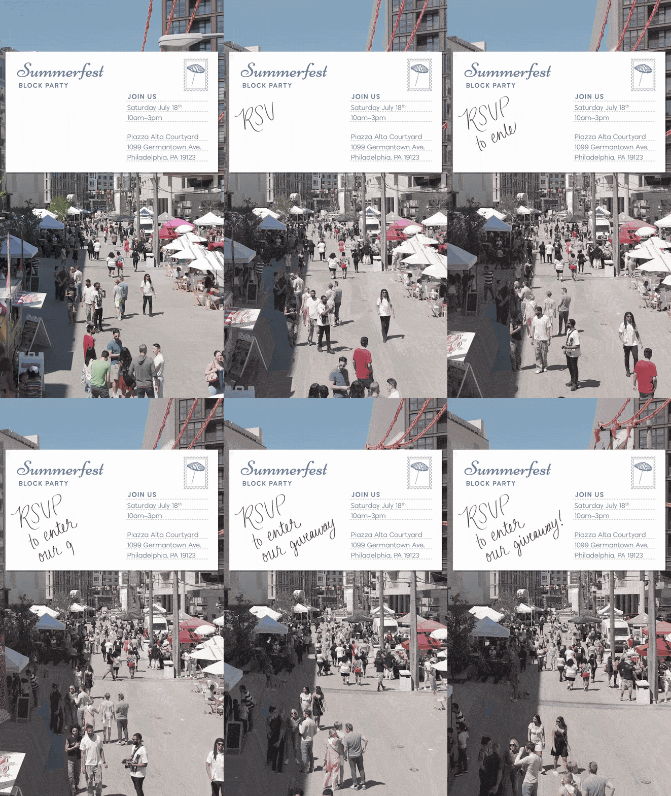
See more
Key Highlights:
• Secured 5 sponsors, including Lululemon, Bluecoat, Two Robbers, Love City Vet, and Bagels & Co., generating $5,500 in sponsorship revenue.
• One of our agents leased a 1BR-H at Piazza Alta to Clay Ham, who mentioned that attending the event and experiencing the community firsthand played a role in his decision to lease at the property.
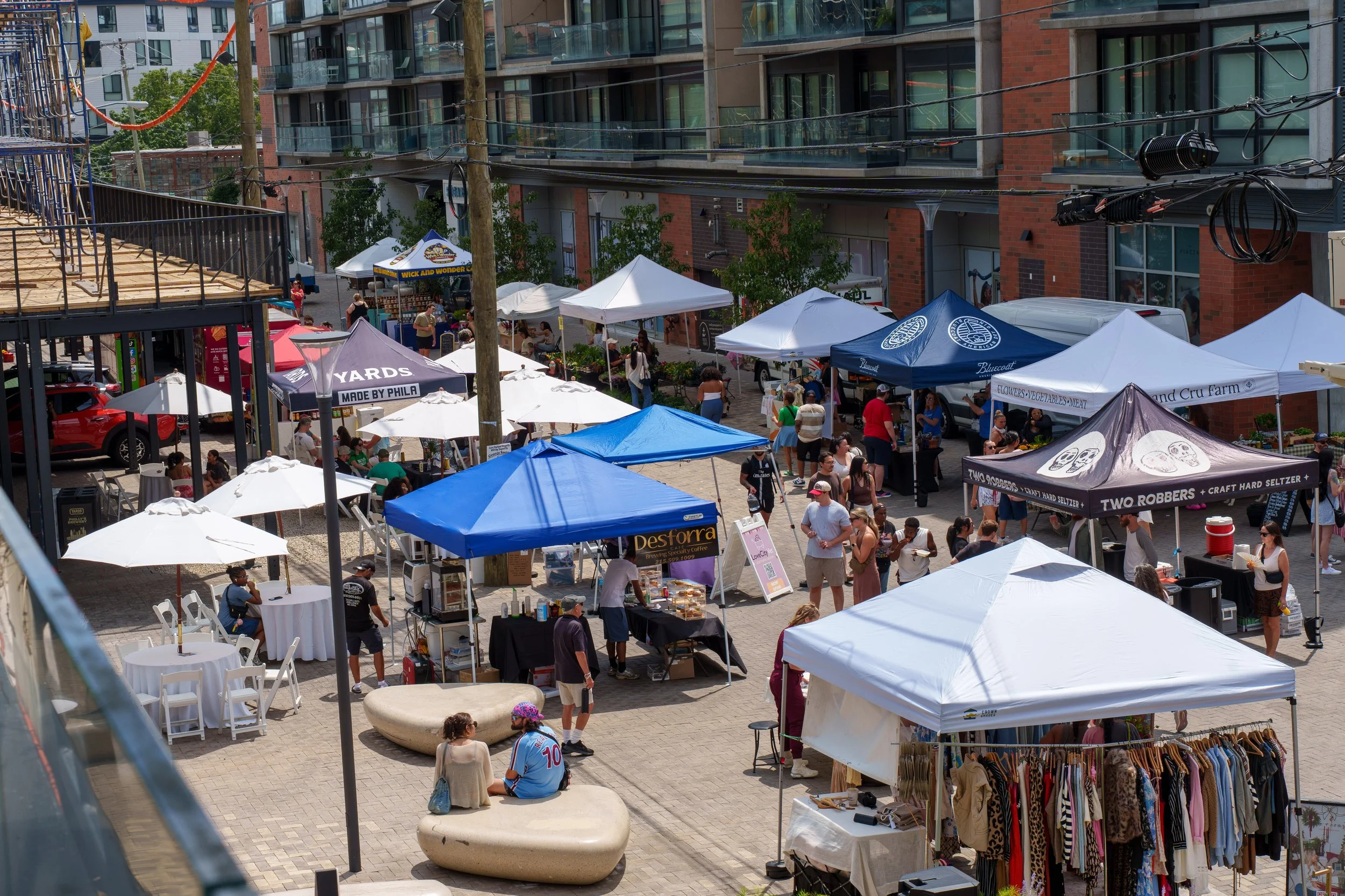
• Hosted 45+ vendors across food, beverage, retail, and farms, with many reporting strong sales.
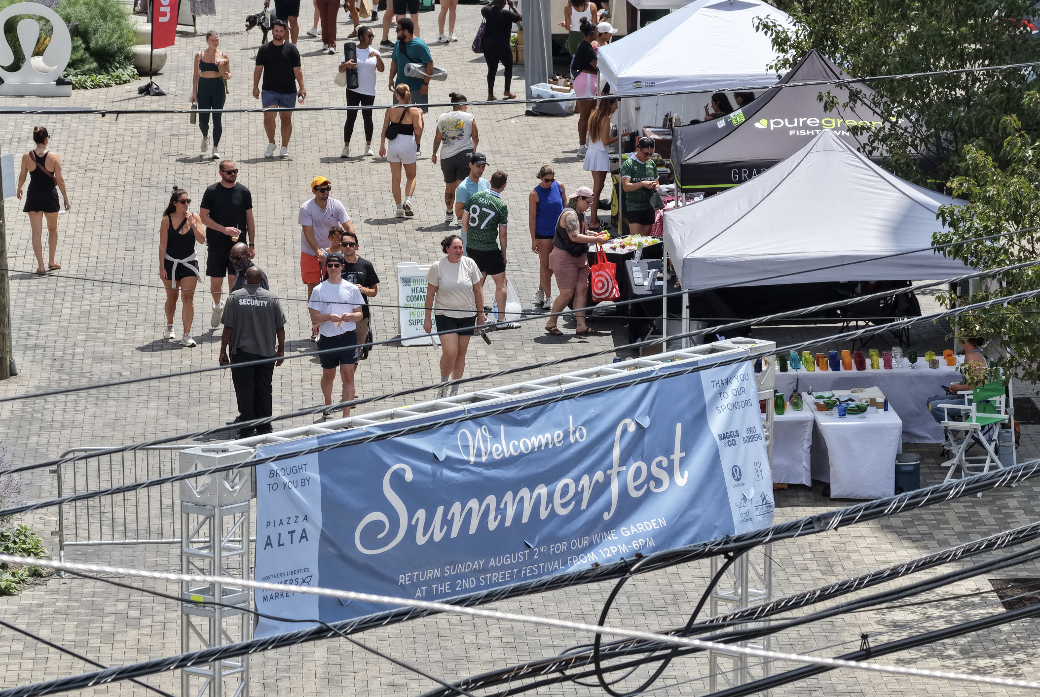
Entrance banner design
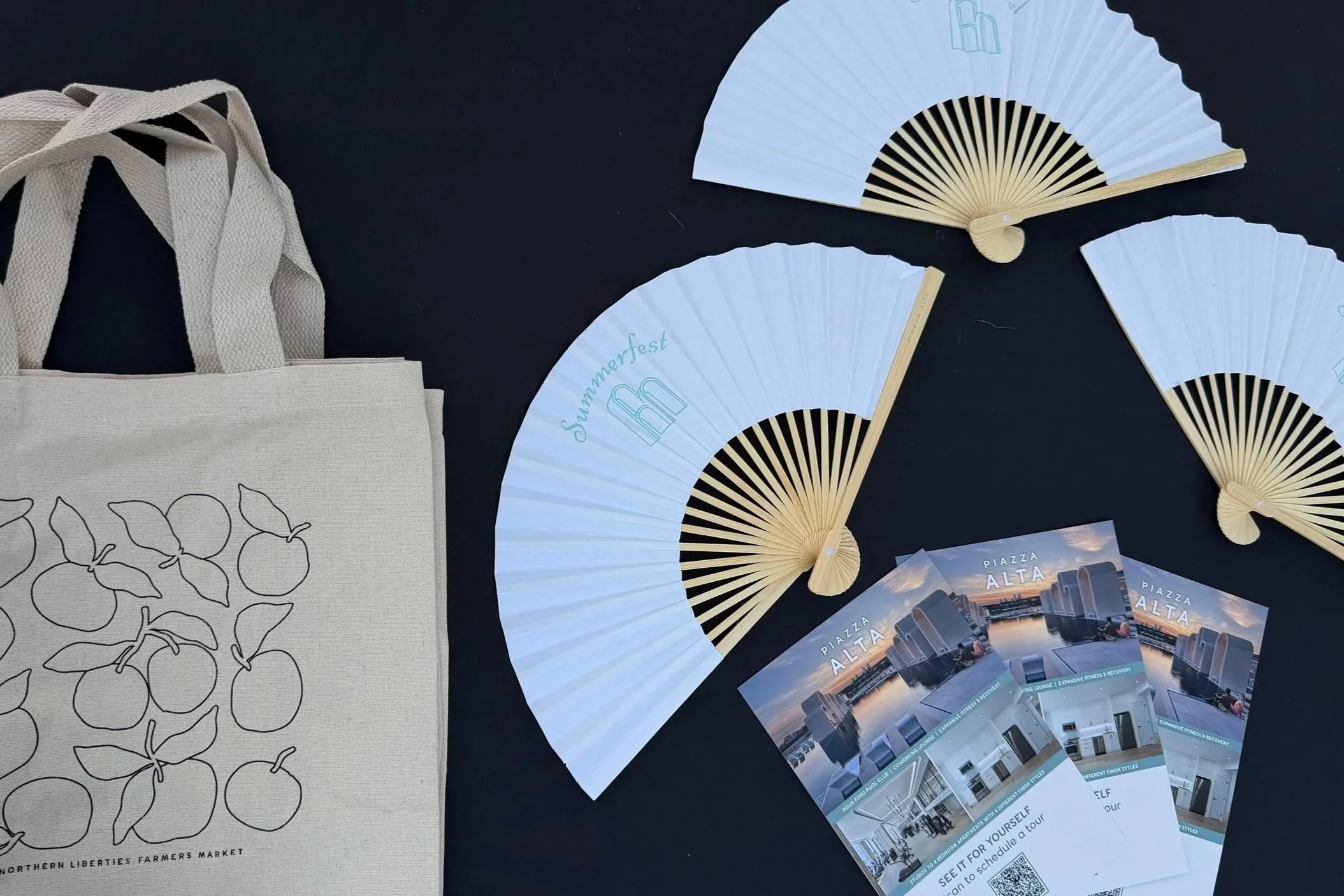
Giveaway collateral